
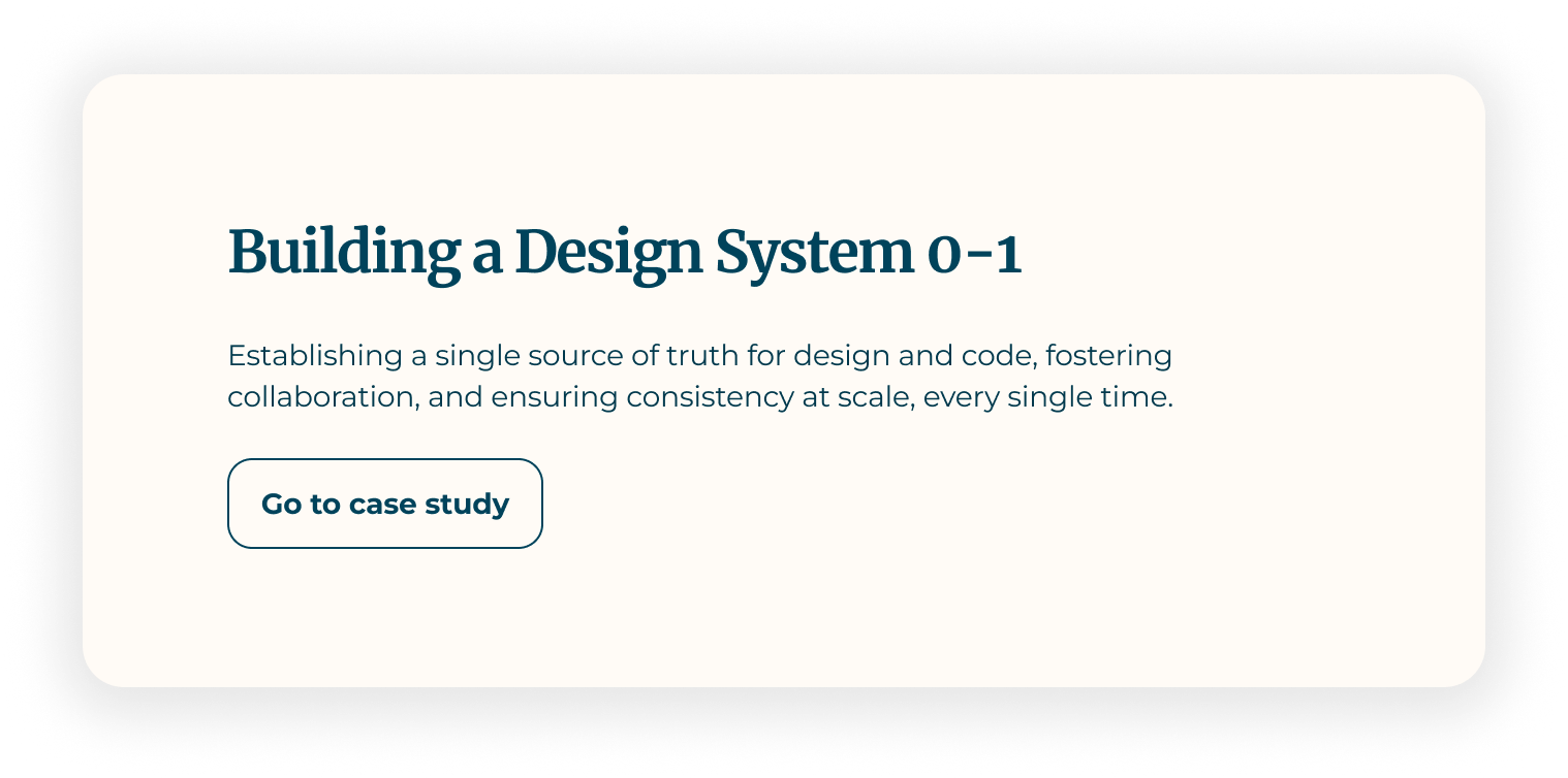
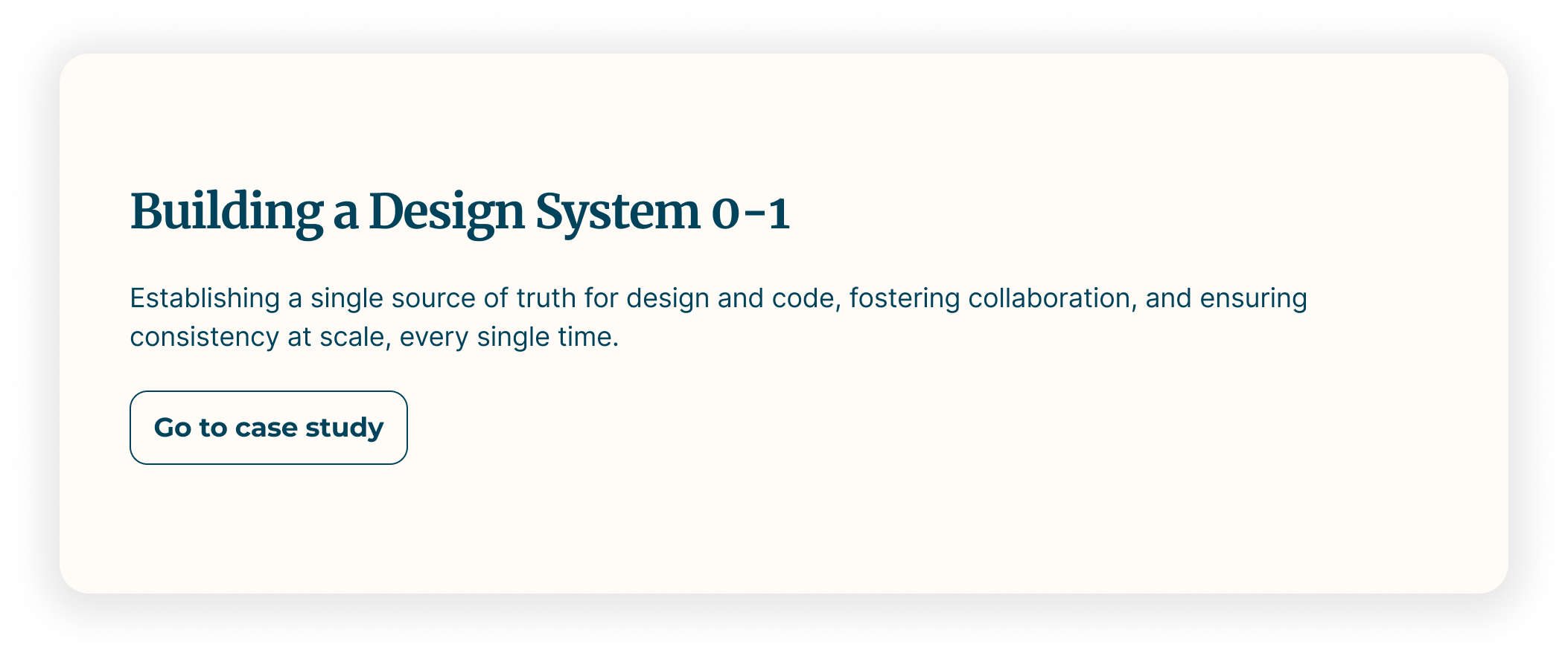
Why we needed a design system?
Professionals aged 30–35, focused on optimising marketing systems, ensuring clean data, and aligning tech to drive scalable revenue impact.
DESIGN GUIDELINES
Without a unified system in place, designers and developers often created or modified components individually, leading to inconsistent sizing and spacing. These small discrepancies added up—causing visual misalignment, reducing design quality, and making it harder to maintain a cohesive UI across the product.
CONTENT GUIDELINES
Components were being reused in ways they weren’t intended for, often due to a lack of documentation or shared understanding. This led to user experience issues, unpredictable behavior, and design debt that had to be corrected later.
SPECIFICATIONS
Teams kept fixing the same usability issues in different places—things that could’ve been solved once with proper components. Without reusable, documented parts, work got repeated and slowed everyone down.
Setting the base
Set up a base documentation pattern for the design team so everyone had a clear starting point when documenting components. It helped keep things consistent across the board—how we show visuals, explain usage, note accessibility, and cover different states. With this structure in place, designers could focus more on creating and less on figuring out how to document things, making it easier for the whole team to contribute and stay aligned.
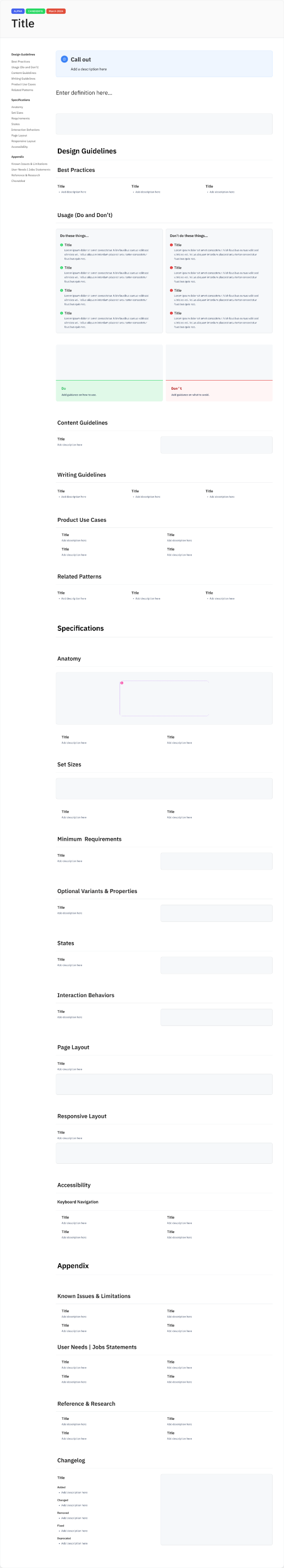
The documentation is divided into three key sections,Design Guidelines, Content Guidelines, and Specifications. Each section is crafted to address the needs of a specific audience.
DESIGN GUIDELINES
Focus on visual principles and layout systems for designers.
CONTENT GUIDELINES
Content Guidelines provide voice, tone, and messaging standards for content creators.
SPECIFICATIONS
Specifications deliver technical details and implementation rules for developers and engineers.
Design Process
Our approach was highly collaborative and iterative, involving stakeholders throughout to test, refine, and validate components before adding them to the system.
🔎
Discovery
We begin by establishing a clear understanding of the current product state. This involves a product audit to uncover inconsistencies and gaps, as well as competitor research to benchmark features and identify opportunities to add value. This stage ensures the team aligns on what we’re solving for and why.
✅
Proposals
Next, we define proposals that outline what components, patterns, or structural changes are needed. These proposals give stakeholders visibility into the design direction early, and help prioritize what’s essential before moving into detailed exploration.
💡️
Concept Exploration
The team then engages in concept exploration, testing different design approaches that balance user needs, brand identity, and business goals. This phase encourages creativity while still staying rooted in the problem space defined during discovery.
♻️
Iterate
Through feedback cycles and collaboration, we refine the chosen concepts. Iteration is a structured yet flexible step where the design matures through validation and cross-functional input, ensuring both feasibility and user va
🖼️
Documenting
To support consistency and scalability, we create documentation and guidelines for the finalized components and patterns. This step ensures that designs are not just one-off solutions but part of a repeatable, sustainable system.
🤝
Hand-off
Finally, we conduct a structured hand-off to engineering, complete with specifications, assets, and ongoing support. The goal is to make implementation smooth and accurate, reducing friction between design and development.
Component Inclusion Criteria
To build a clean, scalable, and effective design system, it’s important to be selective about what gets included. Not every UI element qualifies as a component. To guide this process, I established clear criteria to determine which components and features belong in the system:
Addresses a Common Need
The component solves a user or product problem that recurs across multiple pages, products, or teams—ensuring broad applicability and value.
Fills a Gap in the Existing System
The design system doesn’t already have a component or pattern that effectively handles this use case without workarounds or compromises.
Drives Efficiency and Improves User Experience
Adding the component reduces repetitive design and development efforts while enhancing consistency and usability throughout the product.
Maintaining and Scaling the System
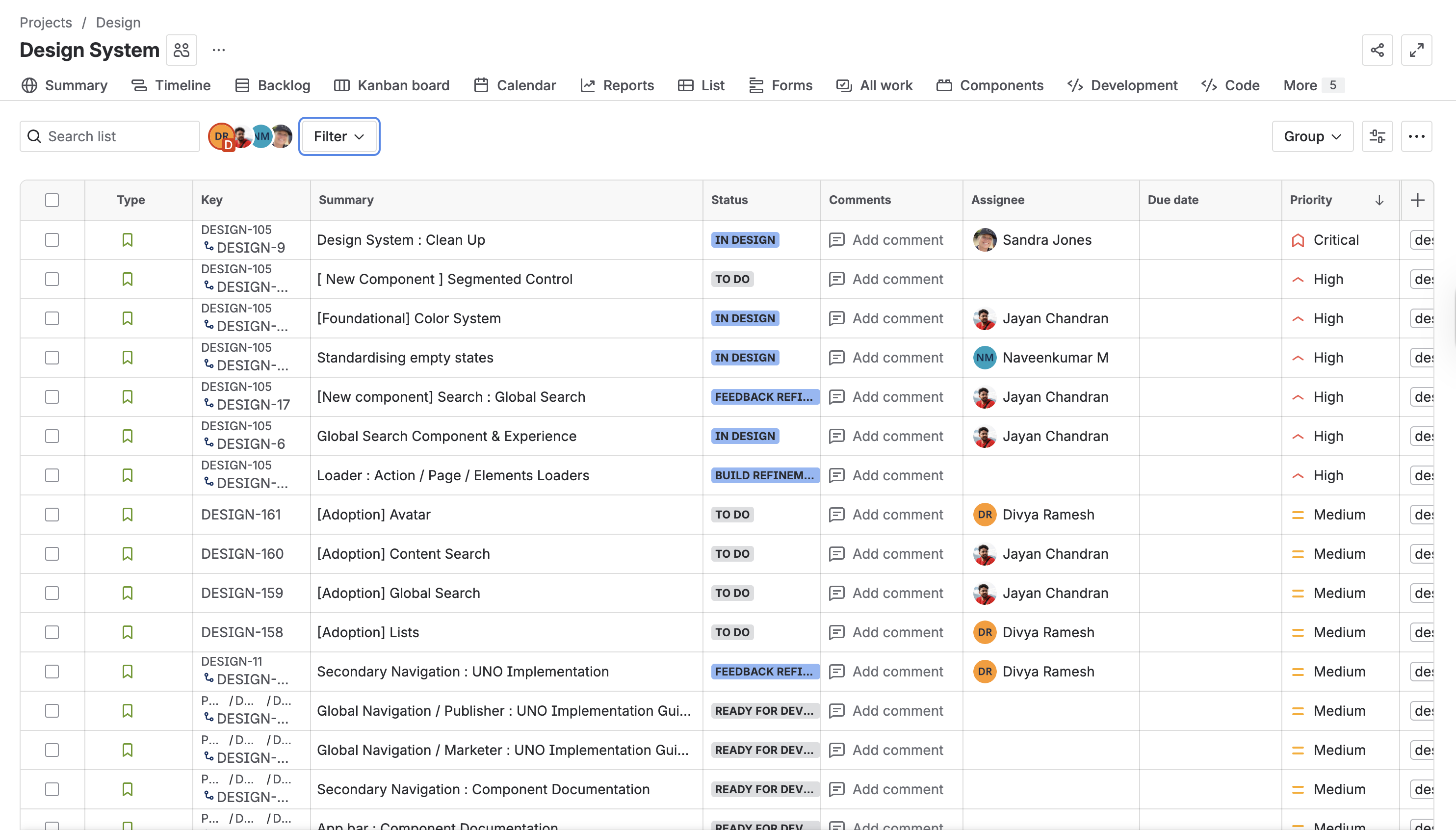
As with any Large Design system, ours have a constant need to add new designs/components and make updates to existing designs/components. In order to ensure that we fully own and manage all incoming requests, i have developed a strong intake process that allows incoming requests based on project / business priorities to be tracked via JIRA and ensured that it is prioritized to closure
Optimising Development Efficiency with AI
As a proactive design researcher, I am currently exploring how we can use Claude and Figma Make to streamline our development process. One of my key initiatives was creating a global CSS file in Figma Make to define our foundational design tokens, which has already helped us reduce development time by 50%.
As a next step, I’m evaluating how we can extend this approach to generate new components directly within Figma Make, further accelerating our design-to-development workflow.
Creating the design system is a collaborative, iterative process focused on team input and thorough testing. Involving all stakeholders helped shape a system that’s not only functional but easy to use and scale. Clear, centralized documentation in Figma captures the full component lifecycle—from use case to handoff—making the system truly effective.
For more details or to connect, reach out at divyajagadis@gmail.com
Why we needed a design system?
Professionals aged 30–35, focused on optimising marketing systems, ensuring clean data, and aligning tech to drive scalable revenue impact.
DESIGN GUIDELINES
Without a unified system in place, designers and developers often created or modified components individually, leading to inconsistent sizing and spacing. These small discrepancies added up—causing visual misalignment, reducing design quality, and making it harder to maintain a cohesive UI across the product.
CONTENT GUIDELINES
Components were being reused in ways they weren’t intended for, often due to a lack of documentation or shared understanding. This led to user experience issues, unpredictable behavior, and design debt that had to be corrected later.
SPECIFICATIONS
Teams kept fixing the same usability issues in different places—things that could’ve been solved once with proper components. Without reusable, documented parts, work got repeated and slowed everyone down.
Setting the base
Set up a base documentation pattern for the design team so everyone had a clear starting point when documenting components. It helped keep things consistent across the board—how we show visuals, explain usage, note accessibility, and cover different states. With this structure in place, designers could focus more on creating and less on figuring out how to document things, making it easier for the whole team to contribute and stay aligned
The documentation is divided into three key sections,Design Guidelines, Content Guidelines, and Specifications. Each section is crafted to address the needs of a specific audience.
DESIGN GUIDELINES
Focus on visual principles and layout systems for designers.
CONTENT GUIDELINES
Content Guidelines provide voice, tone, and messaging standards for content creators.
SPECIFICATIONS
Specifications deliver technical details and implementation rules for developers and engineers.
Design Process
Our approach was highly collaborative and iterative, involving stakeholders throughout to test, refine, and validate components before adding them to the system.
🔎
Discovery
We begin by establishing a clear understanding of the current product state. This involves a product audit to uncover inconsistencies and gaps, as well as competitor research to benchmark features and identify opportunities to add value. This stage ensures the team aligns on what we’re solving for and why.
✅
Proposals
Next, we define proposals that outline what components, patterns, or structural changes are needed. These proposals give stakeholders visibility into the design direction early, and help prioritize what’s essential before moving into detailed exploration.
💡️
Concept Exploration
The team then engages in concept exploration, testing different design approaches that balance user needs, brand identity, and business goals. This phase encourages creativity while still staying rooted in the problem space defined during discovery.
♻️
Iterate
Through feedback cycles and collaboration, we refine the chosen concepts. Iteration is a structured yet flexible step where the design matures through validation and cross-functional input, ensuring both feasibility and user va
🖼️
Documenting
To support consistency and scalability, we create documentation and guidelines for the finalized components and patterns. This step ensures that designs are not just one-off solutions but part of a repeatable, sustainable system.
🤝
Hand-off
Finally, we conduct a structured hand-off to engineering, complete with specifications, assets, and ongoing support. The goal is to make implementation smooth and accurate, reducing friction between design and development.
Component / Feature Inclusion Criteria
To build a clean, scalable, and effective design system, it’s important to be selective about what gets included. Not every UI element qualifies as a component. To guide this process, I established clear criteria to determine which components and features belong in the system:
Addresses a Common Need
The component solves a user or product problem that recurs across multiple pages, products, or teams—ensuring broad applicability and value.
Fills a Gap in the Existing System
The design system doesn’t already have a component or pattern that effectively handles this use case without workarounds or compromises.
Drives Efficiency and Improves User Experience
Adding the component reduces repetitive design and development efforts while enhancing consistency and usability throughout the product.
Maintaining and Scaling the System
As with any Large Design system, ours have a constant need to add new designs/components and make updates to existing designs/components. In order to ensure that we fully own and manage all incoming requests, i have developed a strong intake process that allows incoming requests based on project / business priorities to be tracked via JIRA and ensured that it is prioritized to closure
Optimising Development Efficiency with AI
As a proactive design researcher, I am currently exploring how we can use Claude and Figma Make to streamline our development process. One of my key initiatives was creating a global CSS file in Figma Make to define our foundational design tokens, which has already helped us reduce development time by 50%.
As a next step, I’m evaluating how we can extend this approach to generate new components directly within Figma Make, further accelerating our design-to-development workflow.
Creating the design system was a collaborative, iterative process focused on team input and thorough testing. Involving all stakeholders helped shape a system that’s not only functional but easy to use and scale. Clear, centralized documentation in Figma captures the full component lifecycle—from use case to handoff—making the system truly effective.
For more details or to connect, reach out at divyajagadis@gmail.com
Why we needed a design system?
As our product and team scaled, it became clear that a centralized design system was essential. Several challenges highlighted the need
Inconsistent Component Sizing
Without a shared system, designers and developers often built components on their own, which led to inconsistent sizing and spacing. These small differences added up, making the UI feel messy and harder to keep consistent.
Incorrect Usage of Components
Components were often used incorrectly because there wasn’t clear documentation. This caused UX issues and extra work fixing problems later on.
Wasted Time on Repeated Usability Fixes
Teams kept fixing the same usability issues in different places—things that could’ve been solved once with proper components. Without reusable, documented parts, work got repeated and slowed everyone down.
Setting the base
Set up a base documentation pattern for the design team so everyone had a clear starting point when documenting components. It helped keep things consistent across the board—how we show visuals, explain usage, note accessibility, and cover different states. With this structure in place, designers could focus more on creating and less on figuring out how to document things, making it easier for the whole team to contribute and stay aligned.
The documentation is divided into three key sections,Design Guidelines, Content Guidelines, and Specifications. Each section is crafted to address the needs of a specific audience.
DESIGN GUIDELINES
Focus on product use cases and design principles, usage guidelines and layout systems for designers.
CONTENT GUIDELINES
Content Guidelines provide voice, tone, and messaging standards for content creators.
SPECIFICATIONS
Specifications deliver technical details and implementation rules for developers and engineers.
Design Process
Our approach was highly collaborative and iterative, involving stakeholders throughout to test, refine, and validate components before adding them to the system.
🔎
Discovery
We begin by establishing a clear understanding of the current product state. This involves a product audit to uncover inconsistencies and gaps, as well as competitor research to benchmark features and identify opportunities to add value. This stage ensures the team aligns on what we’re solving for and why.
✅
Proposals
Next, we define proposals that outline what components, patterns, or structural changes are needed. These proposals give stakeholders visibility into the design direction early, and help prioritize what’s essential before moving into detailed exploration.
💡️
Concept Exploration
The team then engages in concept exploration, testing different design approaches that balance user needs, brand identity, and business goals. This phase encourages creativity while still staying rooted in the problem space defined during discovery.
♻️
Iterate
Through feedback cycles and collaboration, we refine the chosen concepts. Iteration is a structured yet flexible step where the design matures through validation and cross-functional input, ensuring both feasibility and user va
🖼️
Documenting
To support consistency and scalability, we create documentation and guidelines for the finalized components and patterns. This step ensures that designs are not just one-off solutions but part of a repeatable, sustainable system.
🤝
Hand-off
Finally, we conduct a structured hand-off to engineering, complete with specifications, assets, and ongoing support. The goal is to make implementation smooth and accurate, reducing friction between design and development.
Component / Feature Inclusion Criteria
To build a clean, scalable, and effective design system, it’s important to be selective about what gets included. Not every UI element qualifies as a component. To guide this process, I established clear criteria to determine which components and features belong in the system:
Addresses a Common Need
The component solves a user or product problem that recurs across multiple pages, products, or teams—ensuring broad applicability and value.
Fills a Gap in the Existing System
The design system doesn’t already have a component or pattern that effectively handles this use case without workarounds or compromises.
Drives Efficiency and Improves User Experience
Adding the component reduces repetitive design and development efforts while enhancing consistency and usability throughout the product.
Maintaining and Scaling the System
As with any Large Design system, ours have a constant need to add new designs/components and make updates to existing designs/components. In order to ensure that we fully own and manage all incoming requests, i have developed a strong intake process that allows incoming requests based on project / business priorities to be tracked via JIRA and ensured that it is prioritized to closure
Optimising Development Efficiency with AI
As a proactive design researcher, I am currently exploring how we can use Claude and Figma Make to streamline our development process. One of my key initiatives was creating a global CSS file in Figma Make to define our foundational design tokens, which has already helped us reduce development time by 50%.
As a next step, I’m evaluating how we can extend this approach to generate new components directly within Figma Make, further accelerating our design-to-development workflow.
Creating the design system was a collaborative, iterative process focused on team input and thorough testing. Involving all stakeholders helped shape a system that’s not only functional but easy to use and scale. Clear, centralized documentation in Figma captures the full component lifecycle—from use case to handoff—making the system truly effective.
For more details or to connect, reach out at divyajagadis@gmail.com