
Kiki’s Bhuvaa : Packaging Design Case Study
A packaging design project for Kiki’s Bhuvaa, a line of daily food premixes. The goal was to create authentic, ingredient-focused, and modern designs that clearly communicate convenience while reflecting the warmth and heritage of Indian home-cooked food. The project involved color exploration, illustration development, typography pairing, and iterative feedback from the target audience, resulting in a cohesive and relatable brand identity.
Go to case study
Project type : Graphic Design with AI
Role : Freelance designer helping with the packaging designs for a premix food line
Industry : Marketing
Tools : Canva, Gemini, Photoshop
Duration : October 2025 , 2 weeks

Introduction
Keerthana Pasupathy is an instagram influencer who has been creating content on social media and youtube focusing on Simple, Home Cooked Foods and how to make them for the past 10 years. She has a follower base of around 300K on instagram. With the experience and feedback that she has got over the years, this year, Keerthana reached out to me to help create branding for her new Venture.
Design brief
Keerthana approached me with a clear and heartfelt vision to create a visual that makes daily cooking easier while preserving the warmth of traditional home-cooked food. Her line of daily food premixes was designed for people who love wholesome, familiar meals but don’t always have the time to prepare everything from scratch.
She wanted the packaging and logo to feel simple, homely, and honest — something that instantly connects with the Indian kitchen while staying modern and approachable.
Discovery
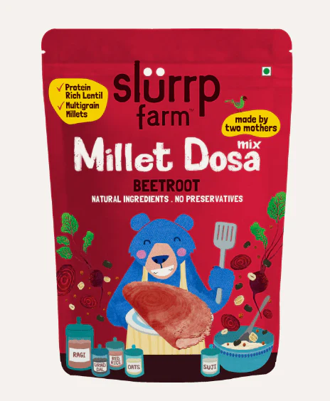
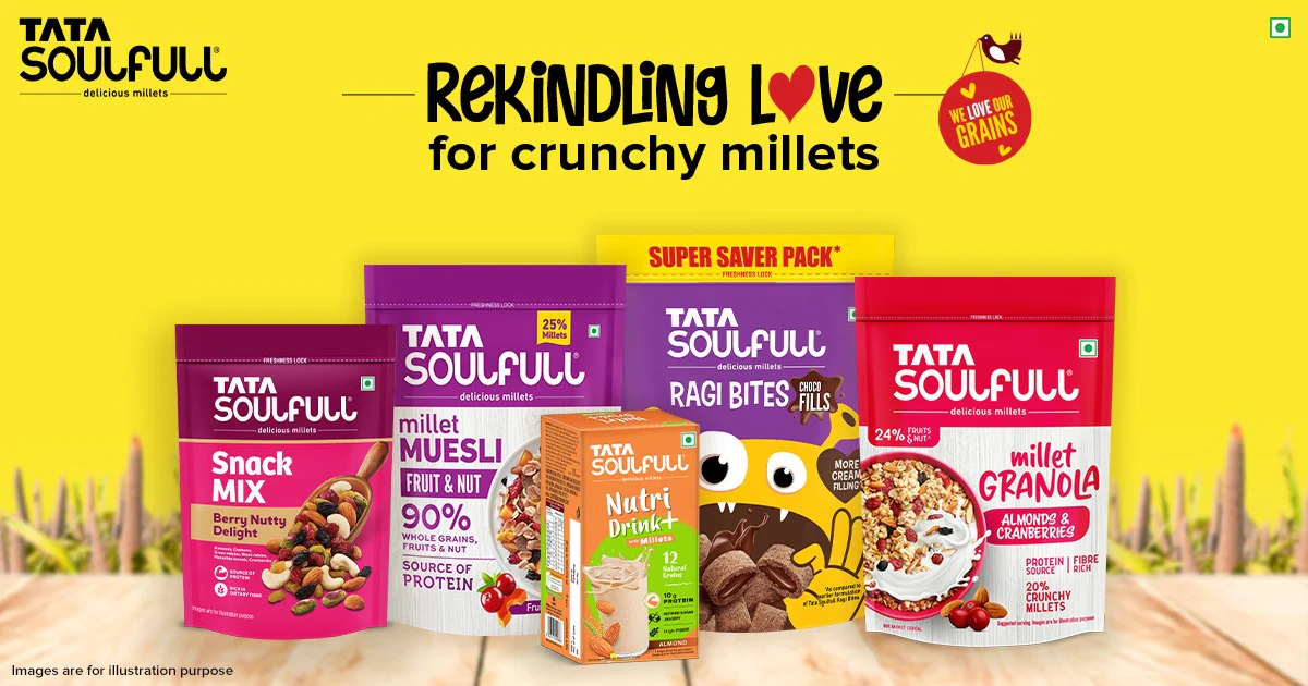
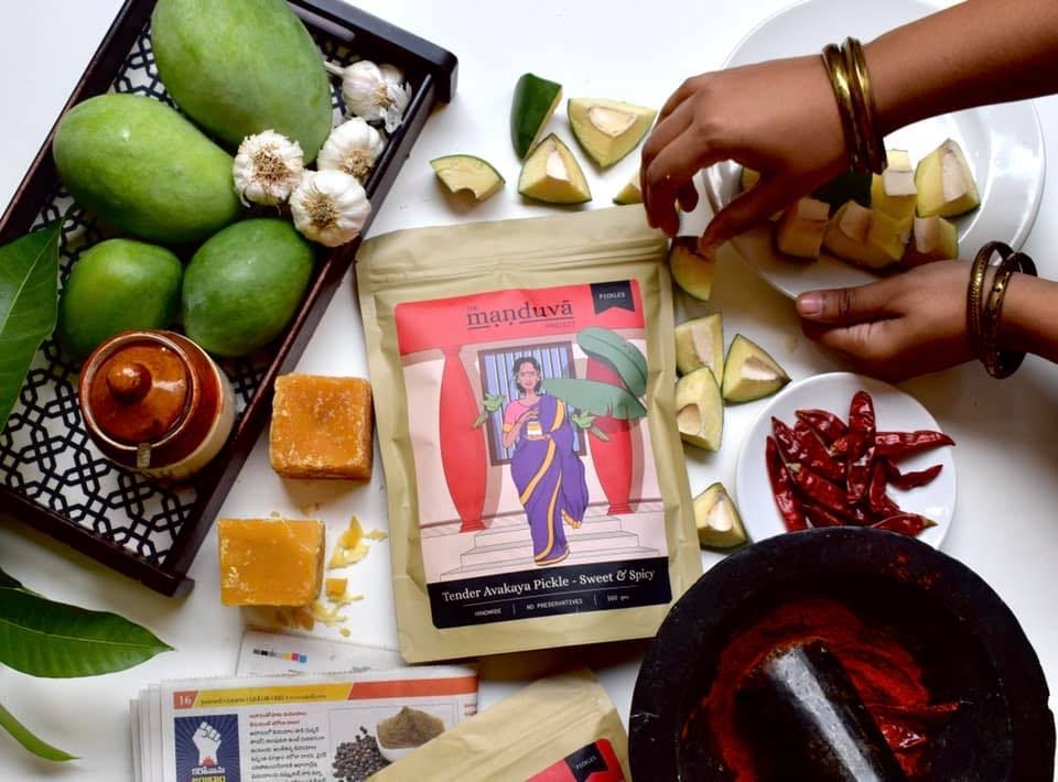
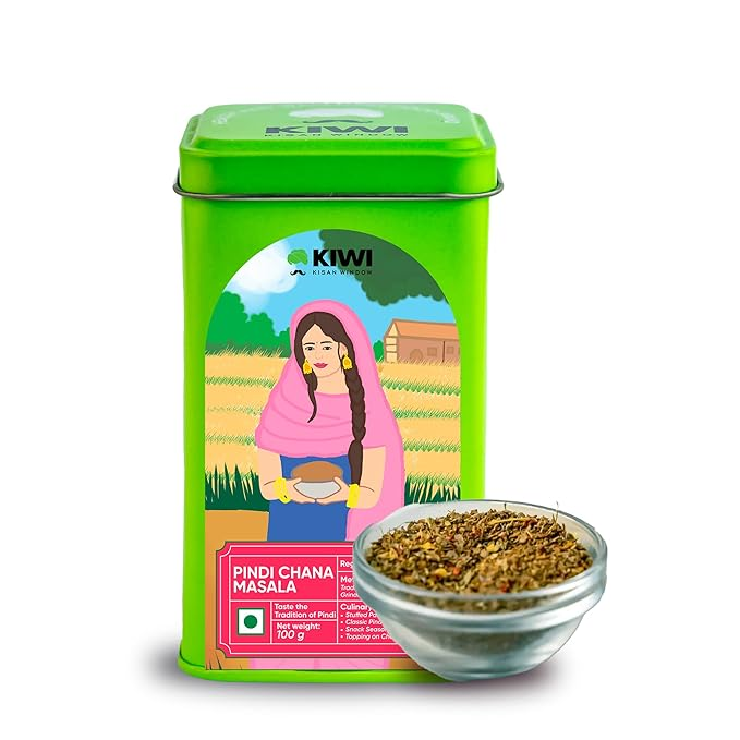
We began by studying Indian brands that cater to a similar audience everyday meal solution brands that balance tradition with modern convenience. The research focused on,
PACKAGING DESIGN LANGUAGE
Color palettes, typography, material choices, and hierarchy of information.
BRAND POSITIONING
How brands communicate authenticity, trust, and ease.
CONSUMER EXPECTATIONS
Clarity of labeling, shelf visibility, and emotional connection through visuals.
Takeaways
While exploring brands that resonate with the idea of home-cooked Indian food, we noticed a clear pattern
Proposal
The proposal initially included several packaging concepts and illustrations created using Gemini, along with color palette ideas. I explored different directions: some concepts emphasised the home-cooked, comforting food feeling, others focused purely on the finished dishes, and some highlighted individual ingredients.
Feedback
In the next stage, Keerthana shared the initial illustration explorations and packaging concepts with a few people from the target market.
“ The images look nice, but I’m not sure if this is a premix. It feels like another ingredient I need to add myself.
“ I want the brand to be about Kiki, not just mom’s or grandma’s food. It should reflect my personality and approach
“ Some packages have a white logo, others a dark logo — it’s hard to recognize the brand across different variants.
“ Love the bold colour approach
“
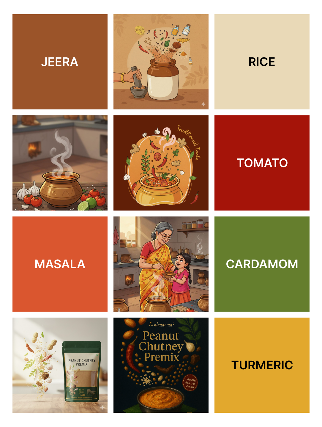
Final color palette
We chose an earthy color palette as in the inspiration board from natural ingredients and traditional Indian foods, reinforcing the brand’s connection to home-cooked meals and authentic flavors.
TOMATO
MASALA
CORIANDER
CHILLI
SAFFRON
TURMERIC
JEERA
CINNAMON
GOKARNI
JAMUN
ANARDANA
RICE
PANEER
Typography
A
Cizel Decorative is used for key headings. Its subtle curves and decorative touches convey warmth, personality, and approachability while being a Serif font conveys traditional with a modern touch
Aa
TT Commons Pro serves as the supporting typeface for body text, ingredient names, and additional information. Its clean, geometric, and highly legible style ensures clarity and readability, complementing the decorative brand name without overpowering it.
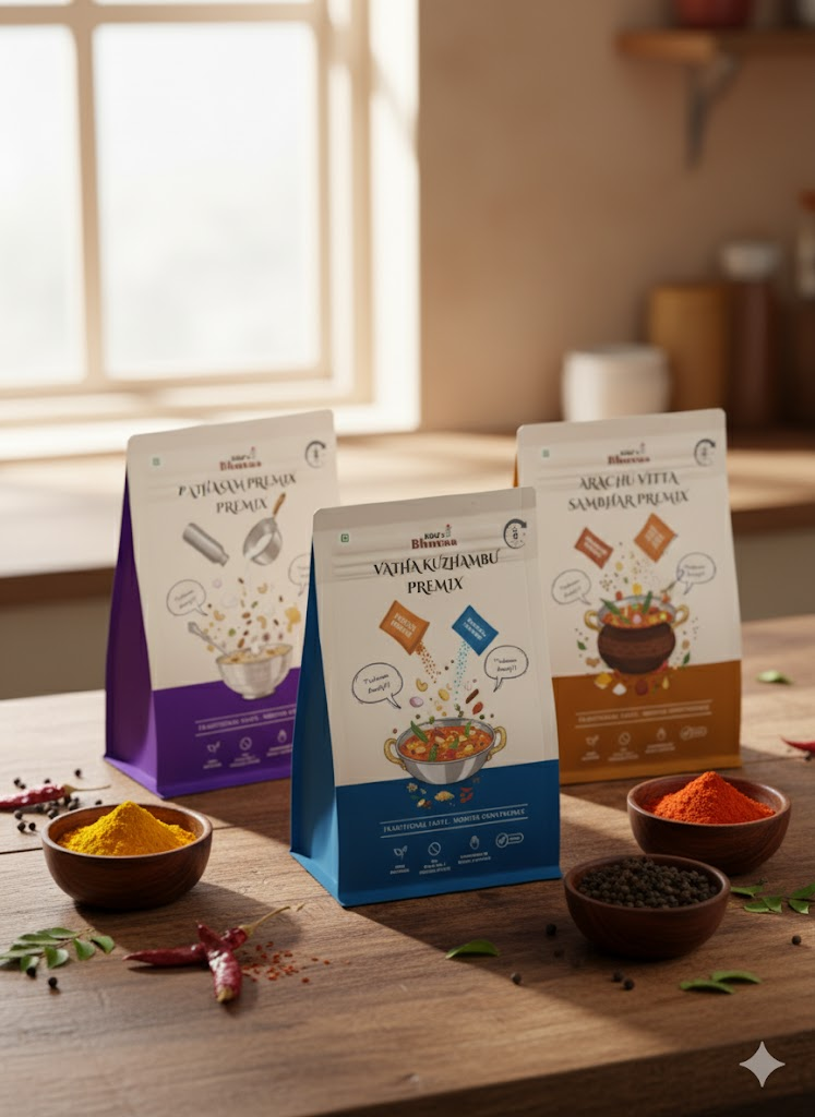
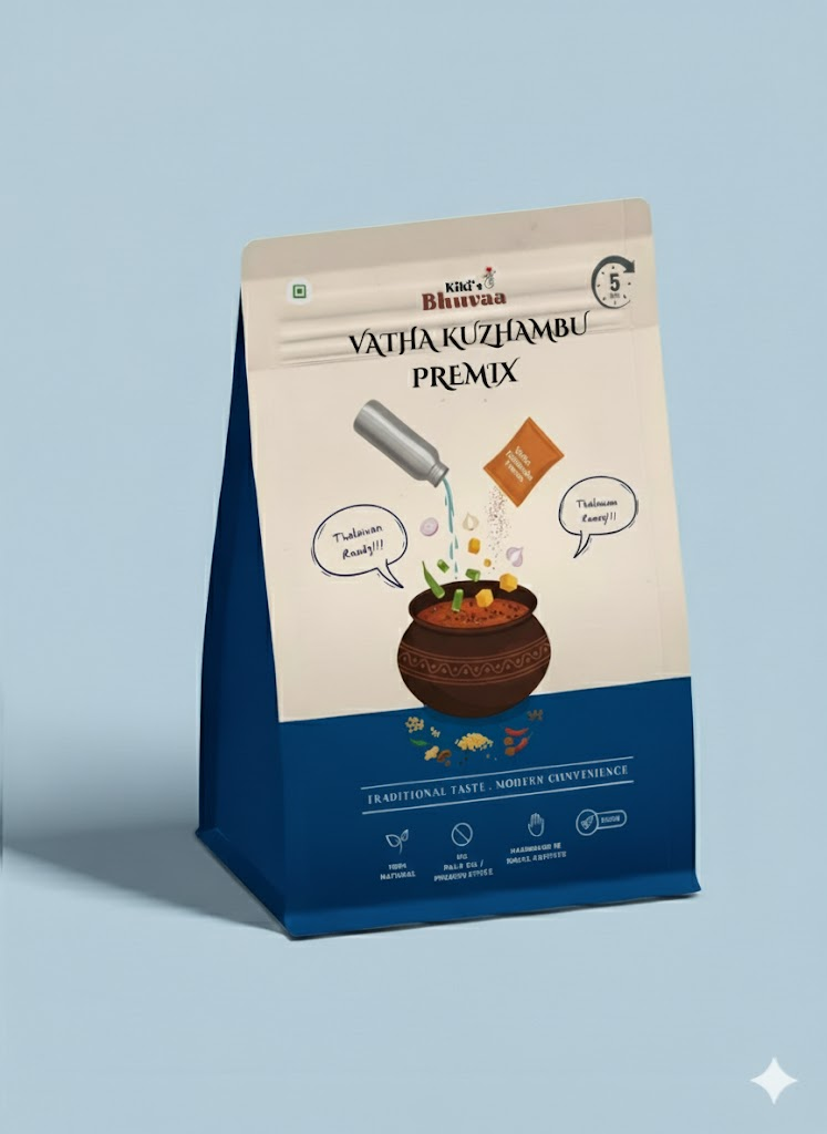
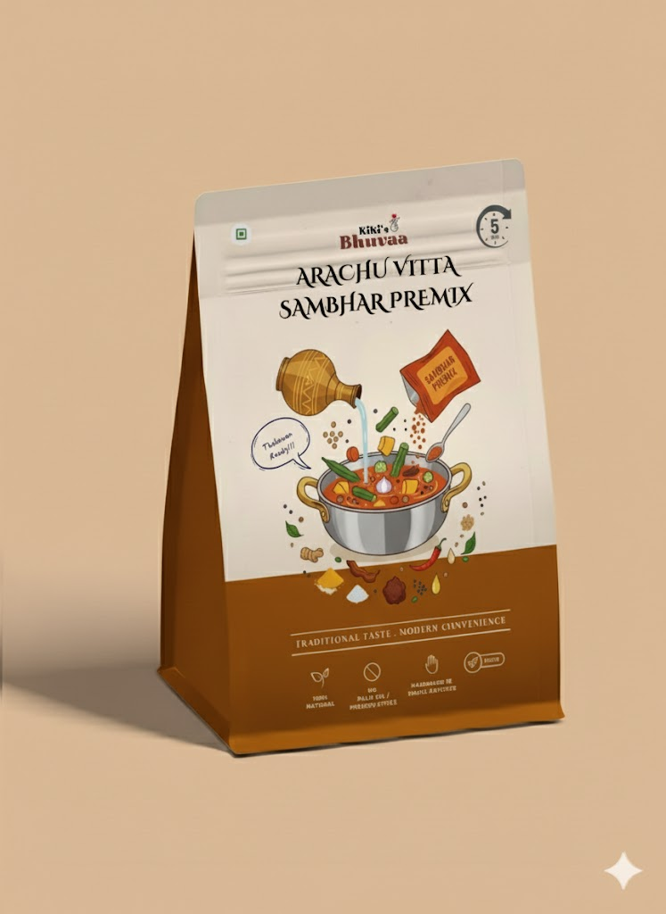
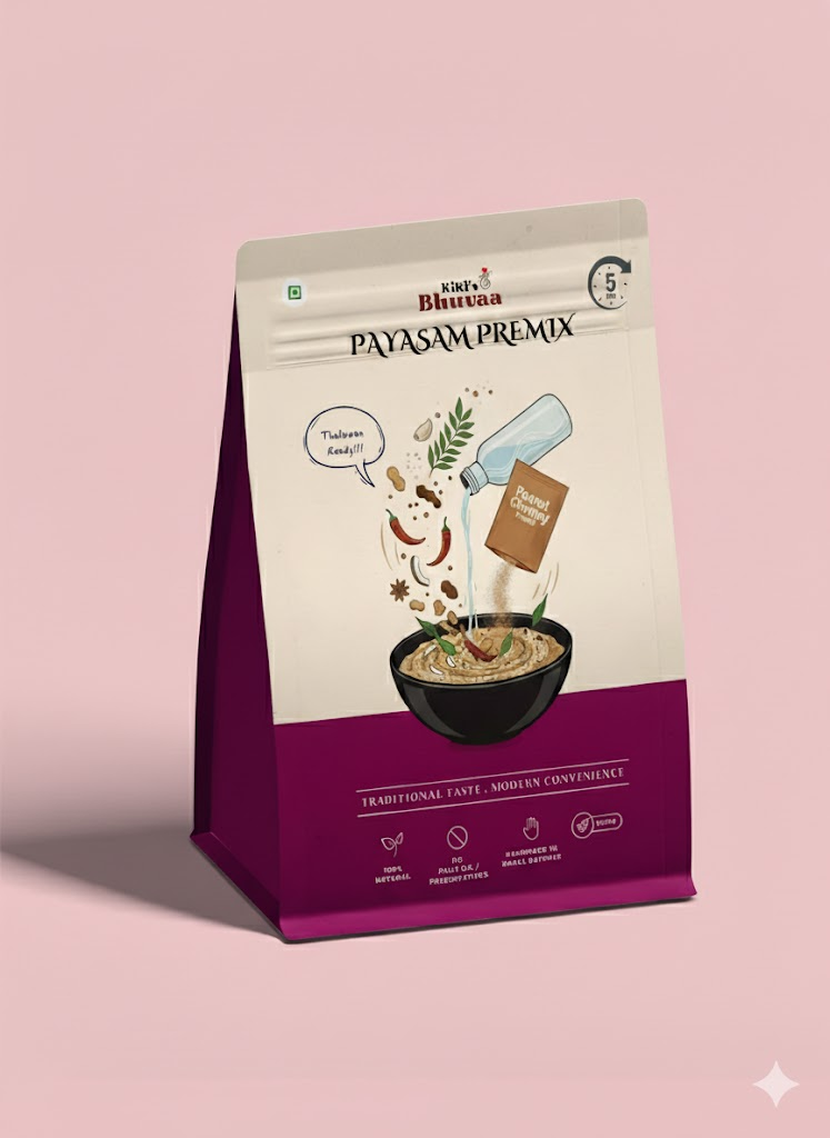
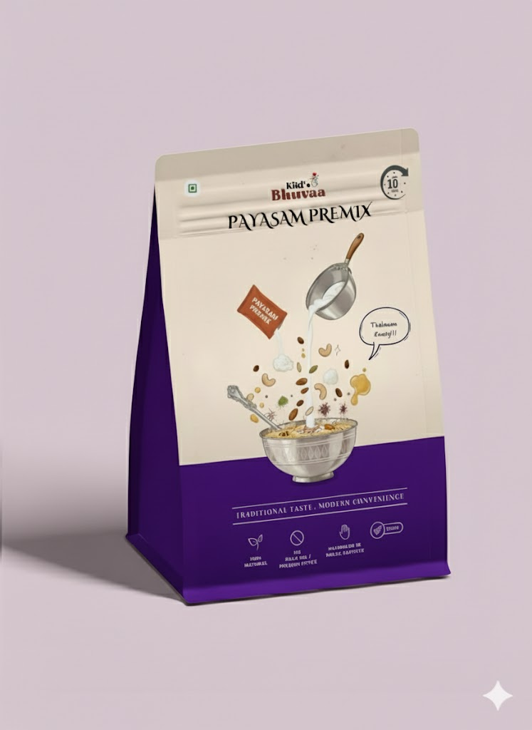
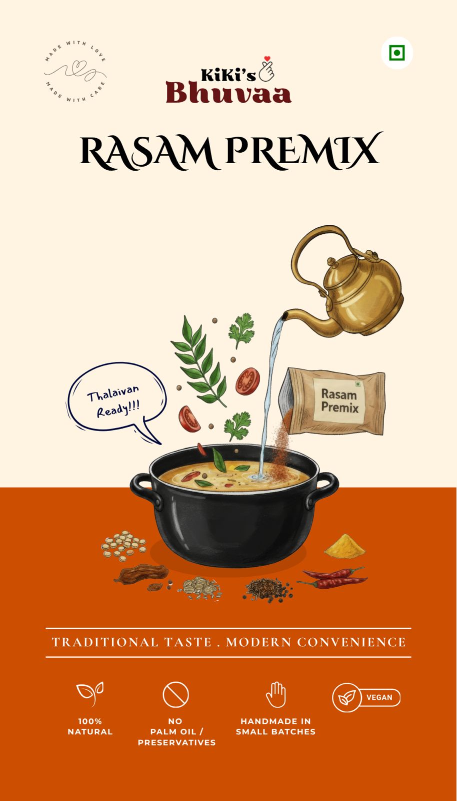
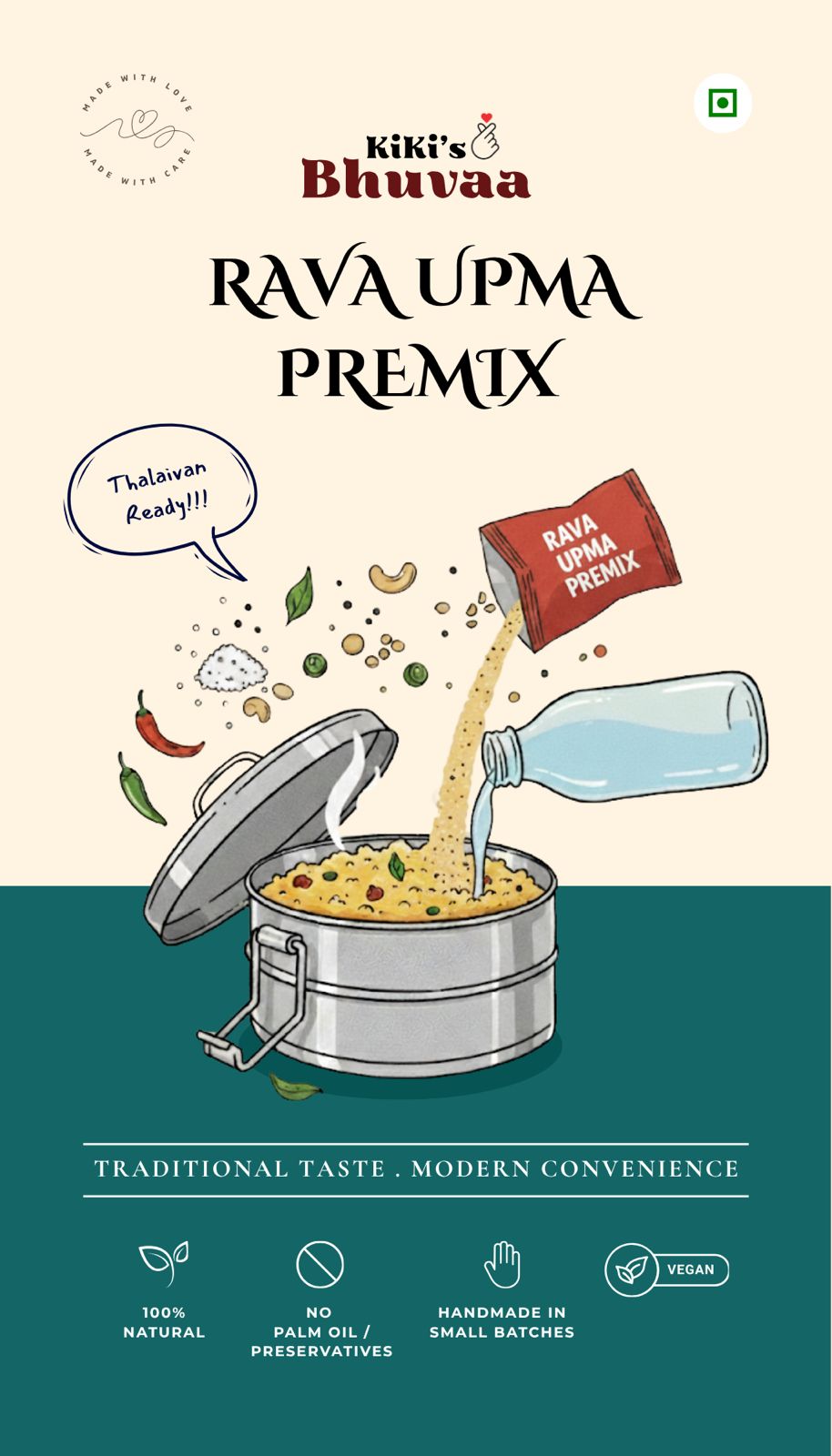
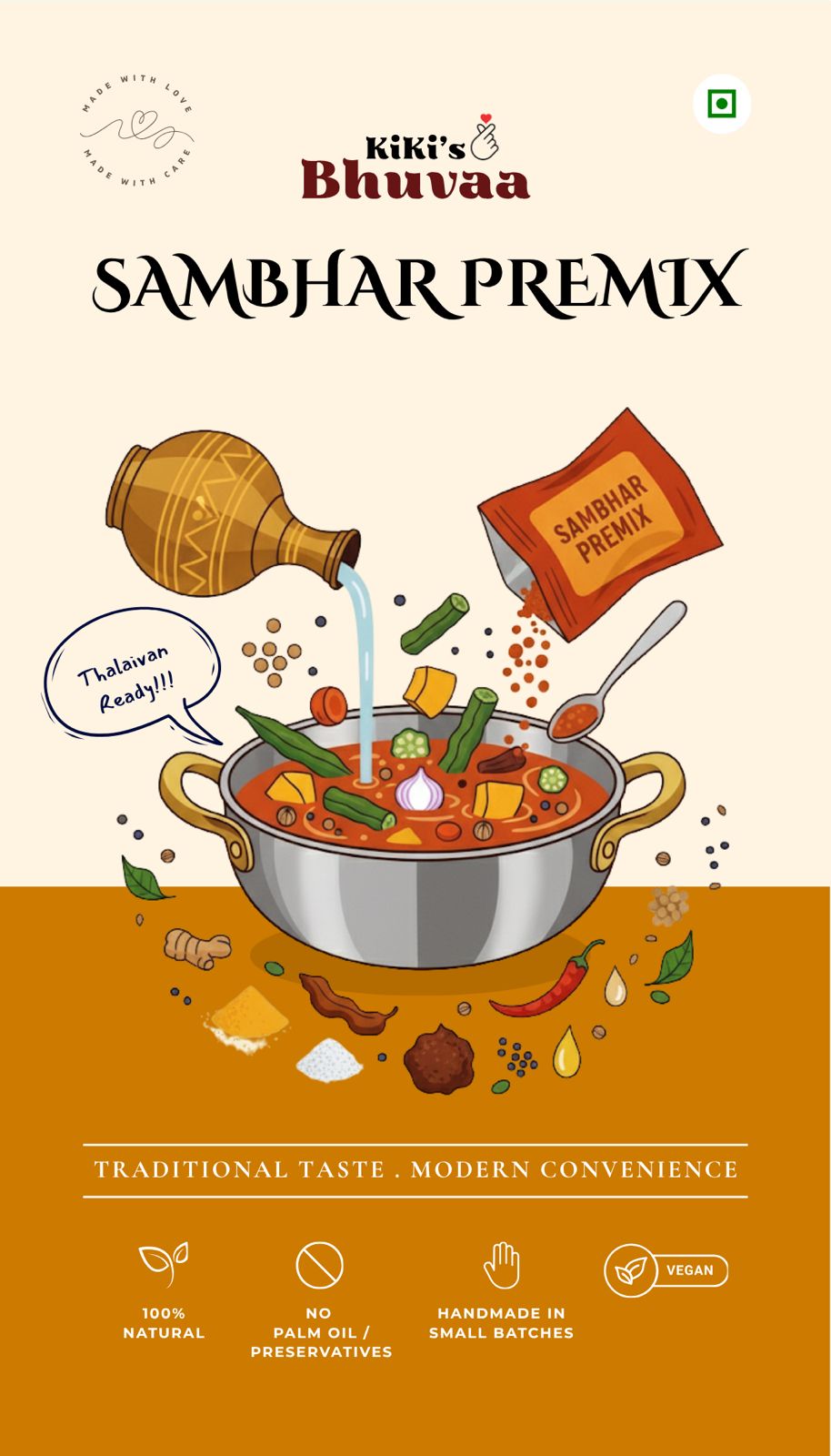
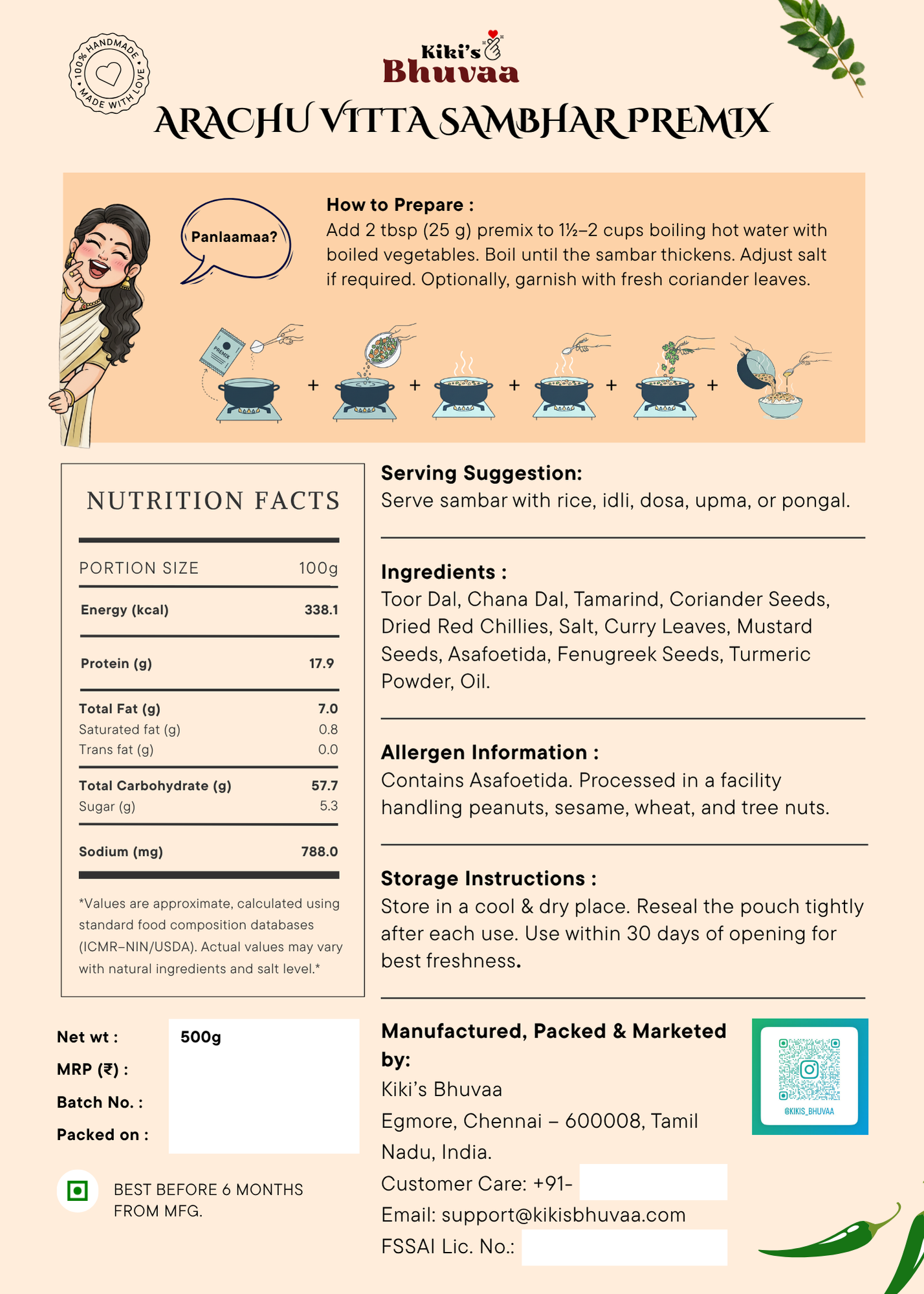
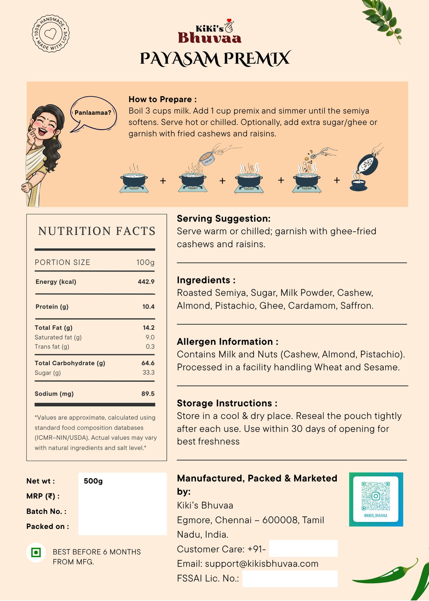
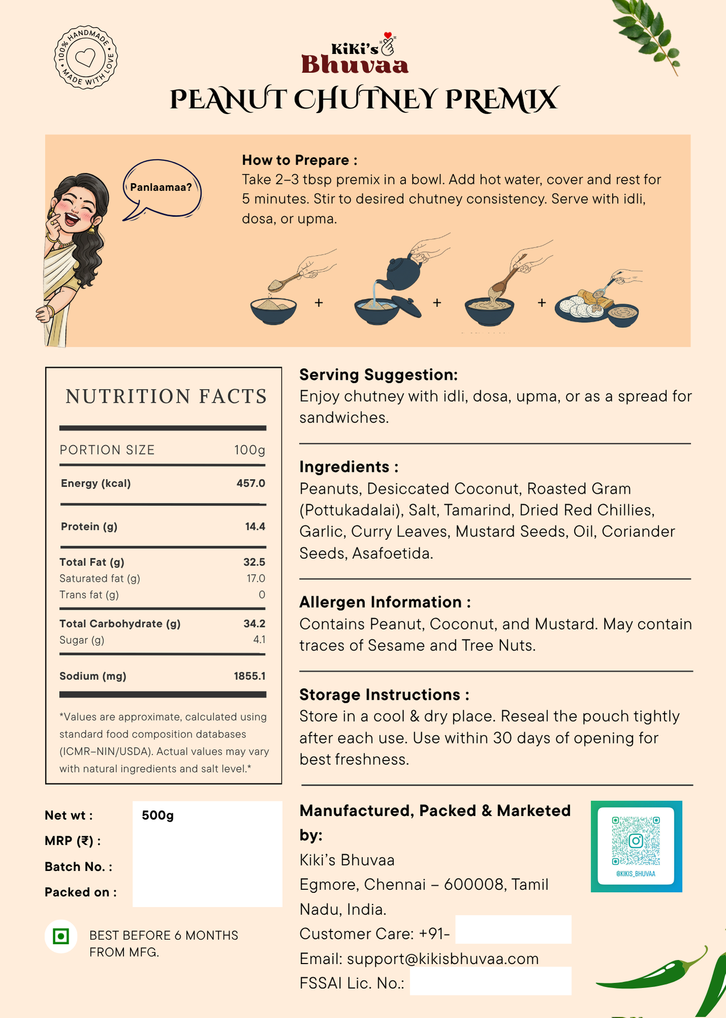
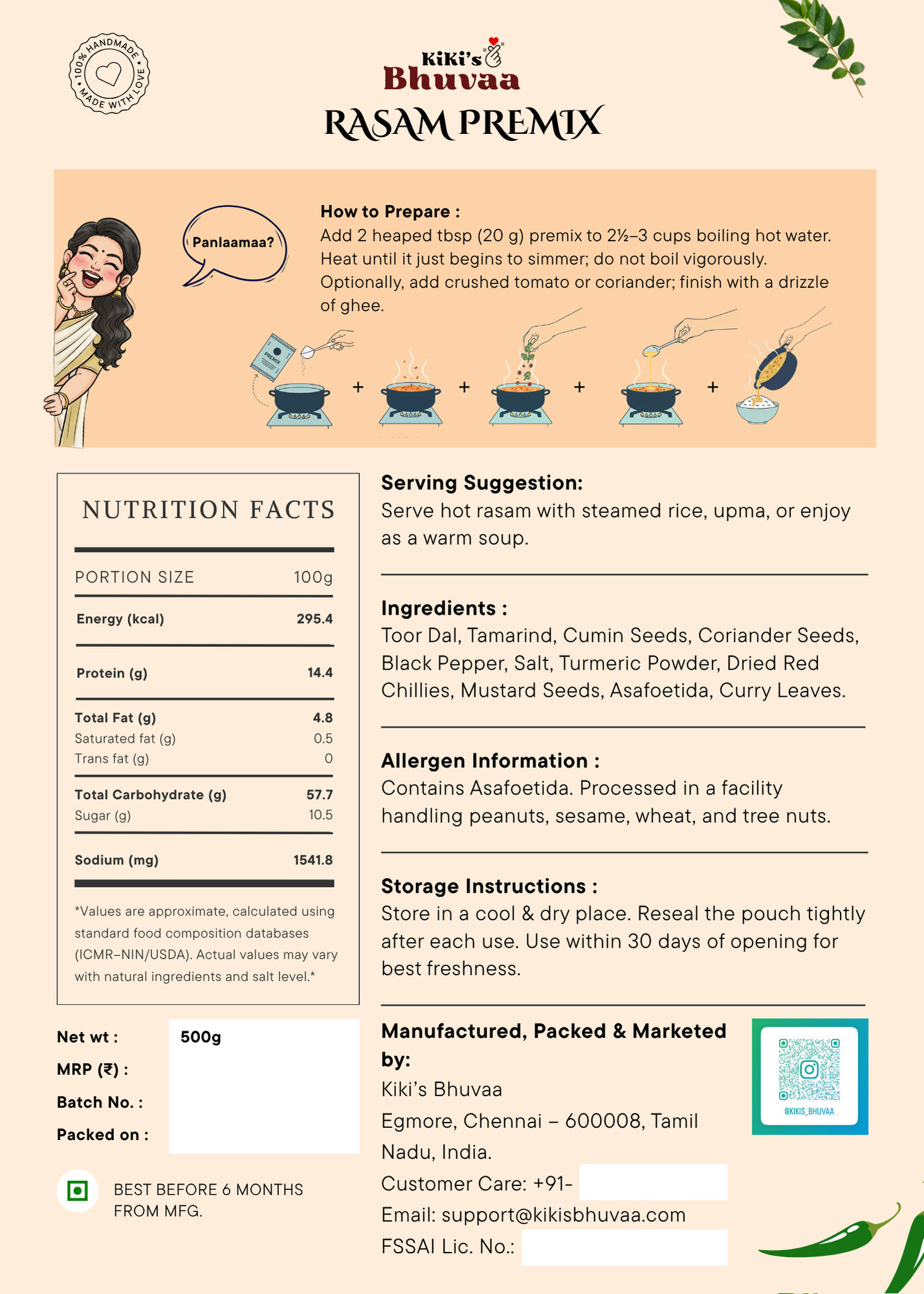
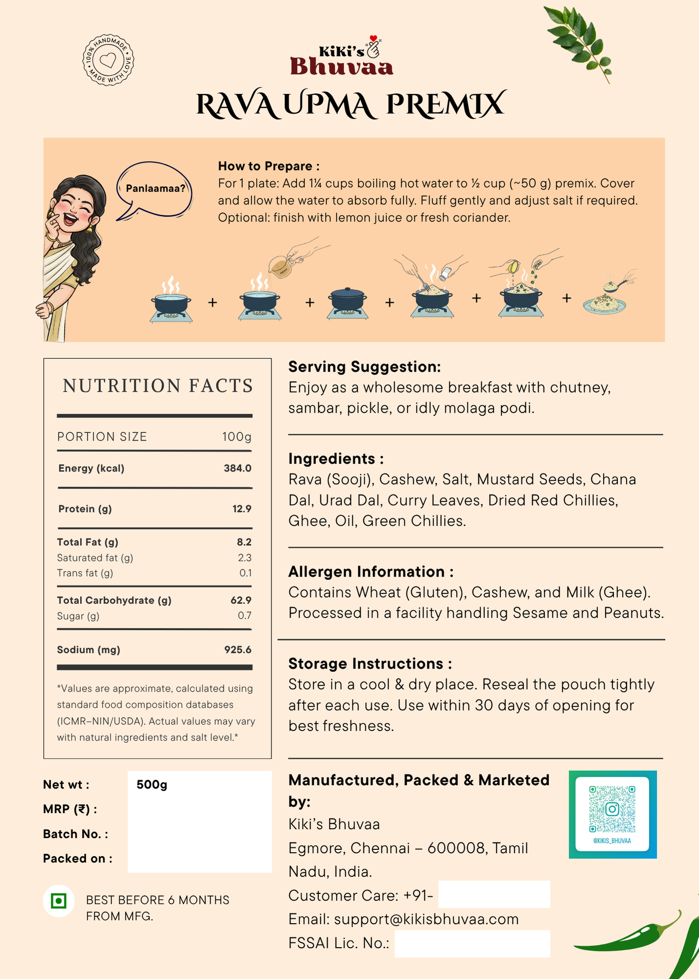
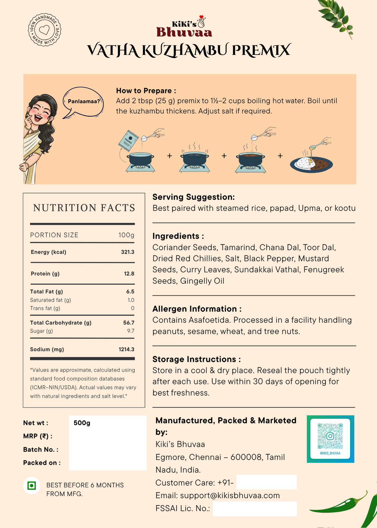
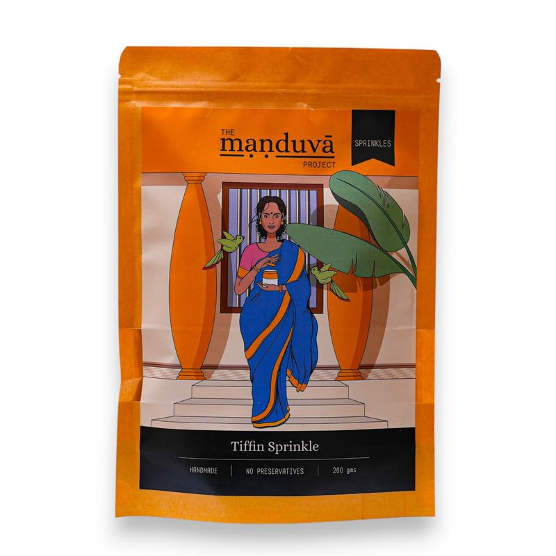
Final Packaging Images
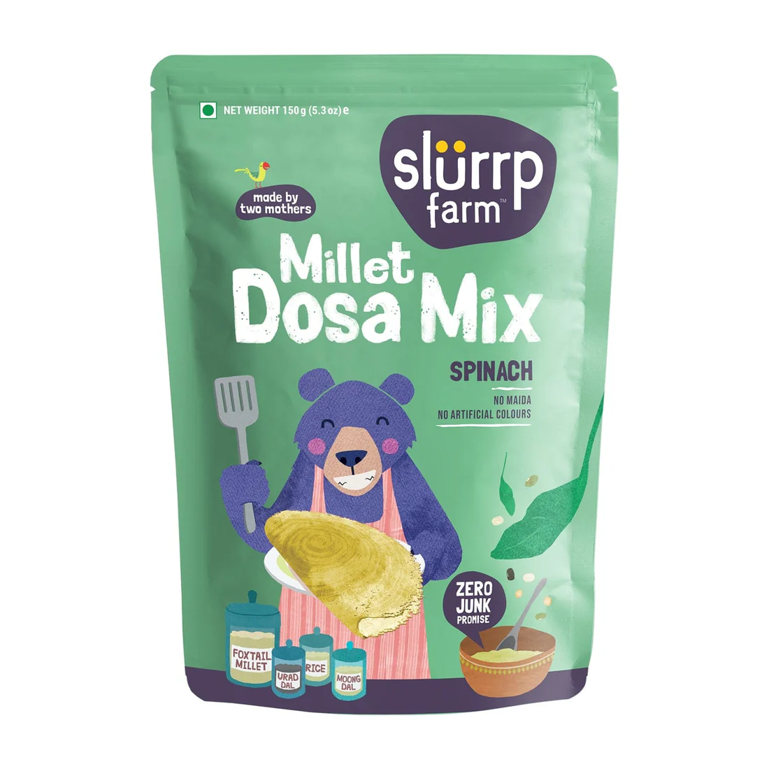
In the final packaging designs, we made the illustrations clearly communicate that these are premixes by showing water being poured, emphasizing the quick preparation. We retained the ingredient-focused approach while using different vessels to indicate preparation style: boxes and bowls for premixes that can be made quickly, and traditional vessels for items that require heating. The traditional vessels maintained a connection to heritage and added a sense of authenticity. We also incorporated some of Keerthana’s Instagram taglines, making the packaging feel more personal, relatable, and distinctly Kiki.
Challenges & learning
One of the main challenges was a tight deadline, as the product line was planned to launch by Diwali. Leveraging AI-generated illustrations significantly accelerated the process, allowing more time to focus on customer feedback, brand relatability, and rapid iterations. Treating AI as a collaborative companion proved extremely helpful — what could have taken months was accomplished in just about two weeks.
However, this project reinforced an important insight: while AI can speed up execution, conceptualization and creative decisions remain fundamentally human. The ideas, brand vision, and emotional storytelling behind Kiki’s Bhuvaa were guided entirely by human understanding and intuition.
Kiki’s Bhuvaa : Packaging Design Case Study
A packaging design project for Kiki’s Bhuvaa, a line of daily food premixes. The goal was to create authentic, ingredient-focused, and modern designs that clearly communicate convenience while reflecting the warmth and heritage of Indian home-cooked food. The project involved color exploration, illustration development, typography pairing, and iterative feedback from the target audience, resulting in a cohesive and relatable brand identity.
Go to case study
Project type : Graphic Design with AI
Role : Freelance designer helping with the packaging designs for a premix food line
Industry : Marketing
Tools : Canva, Gemini, Photoshop
Duration : October 2025 , 2 weeks
Introduction
Keerthana Pasupathy is an instagram influencer who has been creating content on social media and youtube focusing on Simple, Home Cooked Foods and how to make them for the past 10 years. She has a follower base of around 300K on instagram. With the experience and feedback that she has got over the years, this year, Keerthana reached out to me to help create branding for her new Venture.
Design brief
Keerthana approached me with a clear and heartfelt vision to create a visual that makes daily cooking easier while preserving the warmth of traditional home-cooked food. Her line of daily food premixes was designed for people who love wholesome, familiar meals but don’t always have the time to prepare everything from scratch.
She wanted the packaging and logo to feel simple, homely, and honest — something that instantly connects with the Indian kitchen while staying modern and approachable.
Discovery
We began by studying Indian brands that cater to a similar audience everyday meal solution brands that balance tradition with modern convenience. The research focused on,
PACKAGING DESIGN LANGUAGE
Color palettes, typography, material choices, and hierarchy of information.
BRAND POSITIONING
How brands communicate authenticity, trust, and ease.
CONSUMER EXPECTATIONS
Clarity of labeling, shelf visibility, and emotional connection through visuals.
Takeaways
While exploring brands that resonate with the idea of home-cooked Indian food, we noticed a clear pattern
01
Color & Emotional Connection
We found that bright and bold colors — especially deep reds, turmeric yellows, and rich greens — are commonly used by Indian food brands that focus on home-style or traditional cooking. These shades effectively communicate warmth, spice, and familiarity, resonating with the emotional connection people have with everyday meals.
02
Cultural & Emotional Anchors
The visuals incorporated backgrounds, textures, and motifs inspired by traditional kitchens, older Indian homes, and farm settings. They also established a strong connection to Indian women, mothers, and grandmothers, reinforcing the idea of food made with care, passed down through generations, and deeply rooted in family traditions.
03
Illustrative vs. Real Food Imagery
We saw a lot of the brands moving towards illustrations that are simple focusing on ingredients or a more balanced approach using illustrations for specific places and adding touch images where people need to relate to food.
Proposal
The proposal initially included several packaging concepts and illustrations created using Gemini, along with color palette ideas. I explored different directions: some concepts emphasised the home-cooked, comforting food feeling, others focused purely on the finished dishes, and some highlighted individual ingredients.
Feedback
In the next stage, Keerthana shared the initial illustration explorations and packaging concepts with a few people from the target market.
“ The images look nice, but I’m not sure if this is a premix. It feels like another ingredient I need to add myself.
“ I want the brand to be about Kiki, not just mom’s or grandma’s food. It should reflect my personality and approach
“ Some packages have a white logo, others a dark logo — it’s hard to recognize the brand across different variants.
“ Love the bold colour approach
“
Final color palette
We chose an earthy color palette as in the inspiration board from natural ingredients and traditional Indian foods, reinforcing the brand’s connection to home-cooked meals and authentic flavors.
TOMATO
MASALA
CORIANDER
CHILLI
SAFFRON
TURMERIC
JEERA
CINNAMON
GOKARNI
JAMUN
ANARDANA
RICE
PANEER
Typography
A
Cizel Decorative is used for key headings. Its subtle curves and decorative touches convey warmth, personality, and approachability while being a Serif font conveys traditional with a modern touch
Aa
TT Commons Pro serves as the supporting typeface for body text, ingredient names, and additional information. Its clean, geometric, and highly legible style ensures clarity and readability, complementing the decorative brand name without overpowering it.
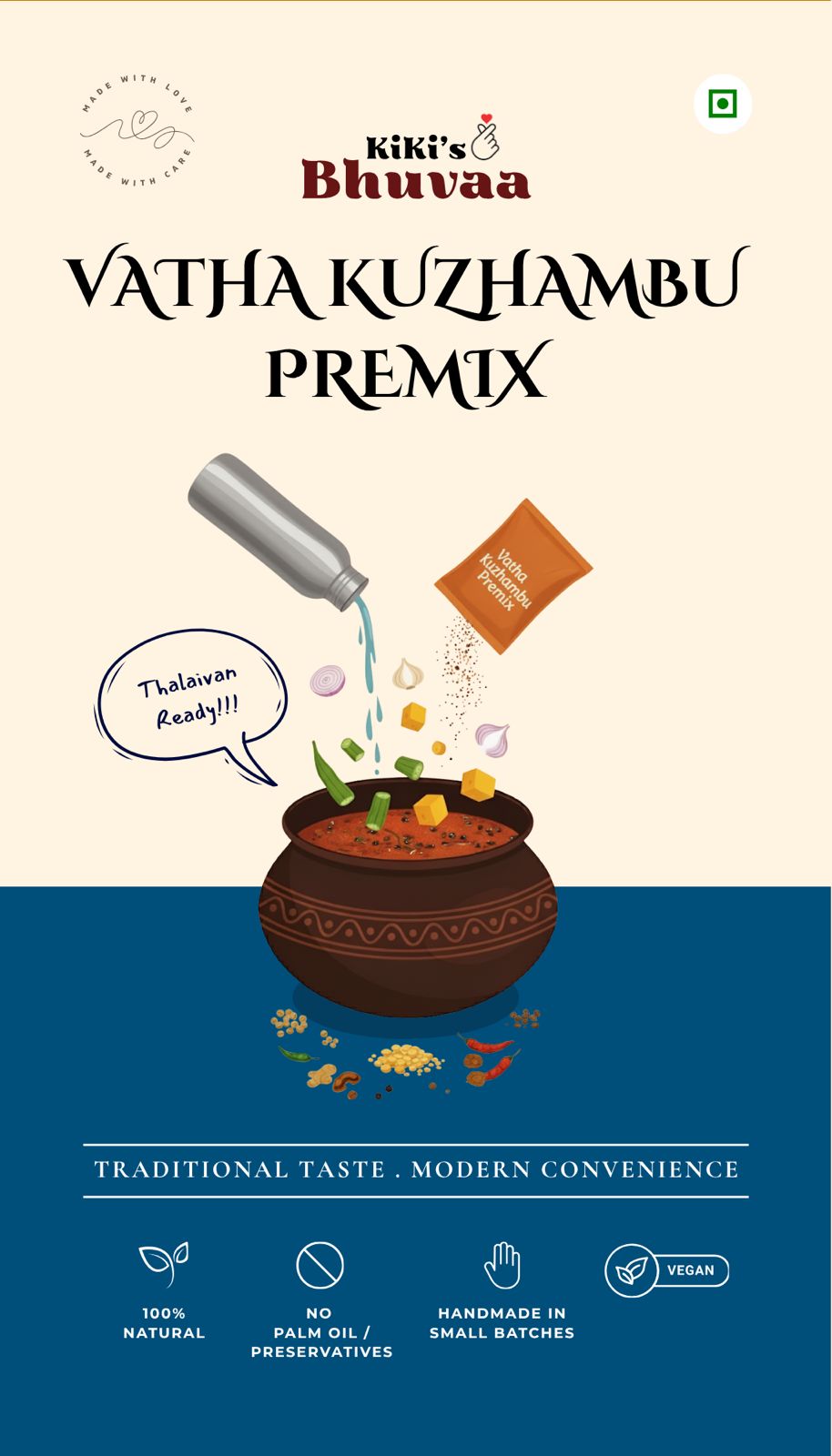
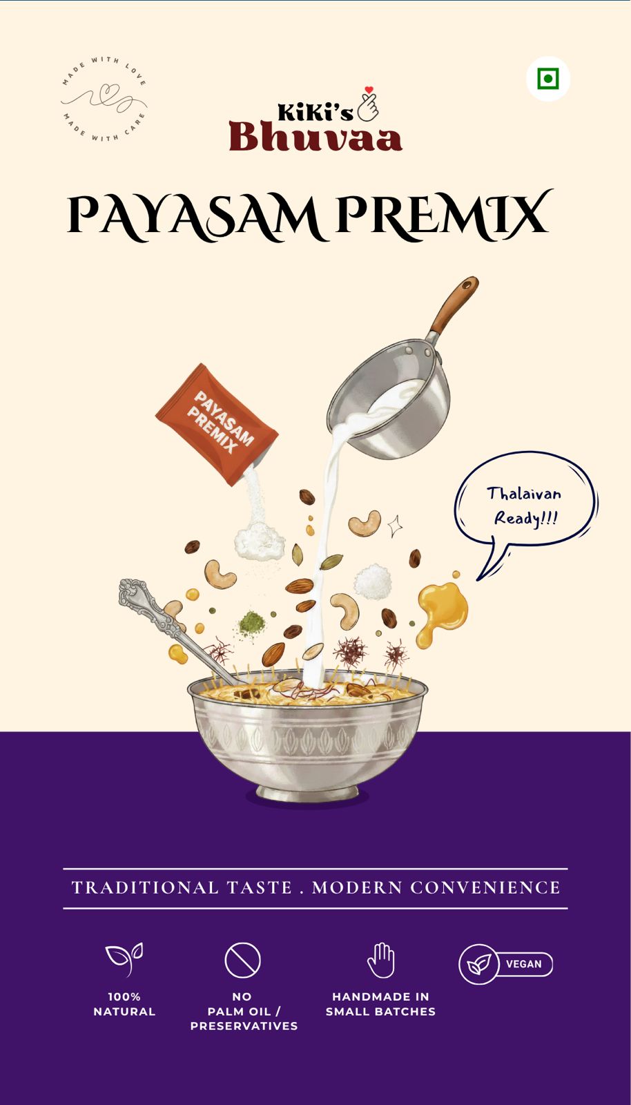
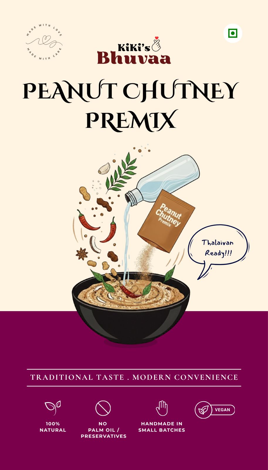
Final Packaging Images
In the final packaging designs, we made the illustrations clearly communicate that these are premixes by showing water being poured, emphasizing the quick preparation. We retained the ingredient-focused approach while using different vessels to indicate preparation style: boxes and bowls for premixes that can be made quickly, and traditional vessels for items that require heating. The traditional vessels maintained a connection to heritage and added a sense of authenticity. We also incorporated some of Keerthana’s Instagram taglines, making the packaging feel more personal, relatable, and distinctly Kiki.
Challenges & learning
One of the main challenges was a tight deadline, as the product line was planned to launch by Diwali. Leveraging AI-generated illustrations significantly accelerated the process, allowing more time to focus on customer feedback, brand relatability, and rapid iterations. Treating AI as a collaborative companion proved extremely helpful — what could have taken months was accomplished in just about two weeks.
However, this project reinforced an important insight: while AI can speed up execution, conceptualization and creative decisions remain fundamentally human. The ideas, brand vision, and emotional storytelling behind Kiki’s Bhuvaa were guided entirely by human understanding and intuition.
Kiki’s Bhuvaa : Packaging Design Case Study
A packaging design project for Kiki’s Bhuvaa, a line of daily food premixes. The goal was to create authentic, ingredient-focused, and modern designs that clearly communicate convenience while reflecting the warmth and heritage of Indian home-cooked food. The project involved color exploration, illustration development, typography pairing, and iterative feedback from the target audience, resulting in a cohesive and relatable brand identity.
Go to case study
Project type : Graphic Design with AI
Role : Freelance designer helping with the packaging designs for a premix food line
Industry : Marketing
Tools : Canva, Gemini, Photoshop
Duration : October 2025 , 2 weeks
Introduction
Keerthana Pasupathy is an instagram influencer who has been creating content on social media and youtube focusing on Simple, Home Cooked Foods and how to make them for the past 10 years. She has a follower base of around 300K on instagram. With the experience and feedback that she has got over the years, this year, Keerthana reached out to me to help create branding for her new Venture.
Design brief
Keerthana approached me with a clear and heartfelt vision to create a visual that makes daily cooking easier while preserving the warmth of traditional home-cooked food. Her line of daily food premixes was designed for people who love wholesome, familiar meals but don’t always have the time to prepare everything from scratch.
She wanted the packaging and logo to feel simple, homely, and honest — something that instantly connects with the Indian kitchen while staying modern and approachable.
Discovery
We began by studying Indian brands that cater to a similar audience everyday meal solution brands that balance tradition with modern convenience. The research focused on,
PACKAGING DESIGN LANGUAGE
Color palettes, typography, material choices, and hierarchy of information.
BRAND POSITIONING
How brands communicate authenticity, trust, and ease.
CONSUMER EXPECTATIONS
Clarity of labeling, shelf visibility, and emotional connection through visuals.
Takeaways
While exploring brands that resonate with the idea of home-cooked Indian food, we noticed a clear pattern
01
Color & Emotional Connection
We found that bright and bold colors — especially deep reds, turmeric yellows, and rich greens — are commonly used by Indian food brands that focus on home-style or traditional cooking. These shades effectively communicate warmth, spice, and familiarity, resonating with the emotional connection people have with everyday meals.
02
Cultural & Emotional Anchors
The visuals incorporated backgrounds, textures, and motifs inspired by traditional kitchens, older Indian homes, and farm settings. They also established a strong connection to Indian women, mothers, and grandmothers, reinforcing the idea of food made with care, passed down through generations, and deeply rooted in family traditions.
03
Illustrative vs. Real Food Imagery
We saw a lot of the brands moving towards illustrations that are simple focusing on ingredients or a more balanced approach using illustrations for specific places and adding touch images where people need to relate to food.
Proposal
The proposal initially included several packaging concepts and illustrations created using Gemini, along with color palette ideas. I explored different directions: some concepts emphasised the home-cooked, comforting food feeling, others focused purely on the finished dishes, and some highlighted individual ingredients.
Feedback
In the next stage, Keerthana shared the initial illustration explorations and packaging concepts with a few people from the target market.
“ The images look nice, but I’m not sure if this is a premix. It feels like another ingredient I need to add myself.
“ I want the brand to be about Kiki, not just mom’s or grandma’s food. It should reflect my personality and approach
“ Some packages have a white logo, others a dark logo — it’s hard to recognize the brand across different variants.
“ Love the bold colour approach
Final color palette
We chose an earthy color palette as in the inspiration board from natural ingredients and traditional Indian foods, reinforcing the brand’s connection to home-cooked meals and authentic flavors.
TOMATO
MASALA
CORIANDER
CHILLI
SAFFRON
TURMERIC
JEERA
CINNAMON
GOKARNI
JAMUN
ANARDANA
RICE
PANEER
Typography
A
Cizel Decorative is used for key headings. Its subtle curves and decorative touches convey warmth, personality, and approachability while being a Serif font conveys traditional with a modern touch
Aa
TT Commons Pro serves as the supporting typeface for body text, ingredient names, and additional information. Its clean, geometric, and highly legible style ensures clarity and readability, complementing the decorative brand name without overpowering it.
Final Packaging Images
In the final packaging designs, we made the illustrations clearly communicate that these are premixes by showing water being poured, emphasizing the quick preparation. We retained the ingredient-focused approach while using different vessels to indicate preparation style: boxes and bowls for premixes that can be made quickly, and traditional vessels for items that require heating. The traditional vessels maintained a connection to heritage and added a sense of authenticity. We also incorporated some of Keerthana’s Instagram taglines, making the packaging feel more personal, relatable, and distinctly Kiki.
Challenges & learning
One of the main challenges was a tight deadline, as the product line was planned to launch by Diwali. Leveraging AI-generated illustrations significantly accelerated the process, allowing more time to focus on customer feedback, brand relatability, and rapid iterations. Treating AI as a collaborative companion proved extremely helpful what could have taken months was accomplished in just about two weeks.
However, this project reinforced an important insight: while AI can speed up execution, conceptualization and creative decisions remain fundamentally human. The ideas, brand vision, and emotional storytelling behind Kiki’s Bhuvaa were guided entirely by human understanding and intuition.